Microsoft got a new Logo after 25 years. Here is the new logo.


This Microsoft New logo contains the four sqaure and the name of the company. Logo designer Sagi Haviv for the Library of Congress and Armani Exchange, thinks that the logo simply isn’t distinctive enough. By opting for a simple array of four colored squares, Haviv says Microsoft missed a big opportunity.It kinda looks like Google’s Logo.
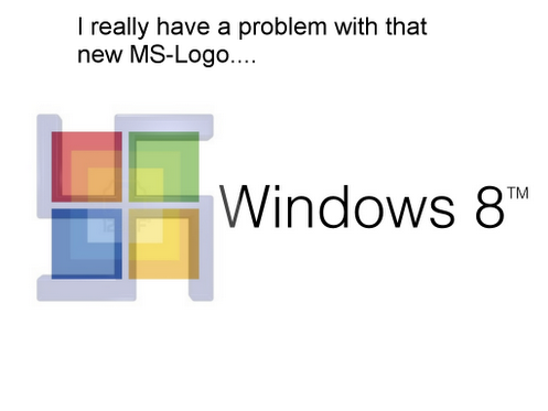
Here’s a image I found in Google +.

The image is right. It looks like the Nazi Symbol. But it’s a good logo.
Hoping Windows 8 would be good.